Dear Future
A Personal Reflection & Goal-Tracking Android App
Our GitLab RepositoryBrief Description
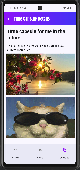
Dear Future is an Android application that helps users reflect on their past selves, plan goals for personal growth, and make their future self a reality instead of a dream. The app allows users to write letters to their future self and store digital time capsules that can be opened at a later date.
Target User
The target users of Dear Future are everybody, especially people interested in personal development, goal-setting, and self-reflection. People of age 12 and up, as well as technologically familiar.
Goal of the App
The main goal of Dear Future is to encourage long-term thinking and self-awareness by helping users connect their past and future selves in a structured and meaningful way.
Design process
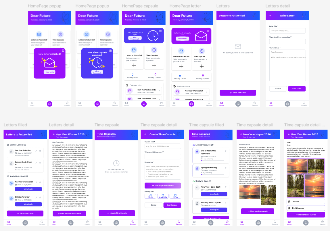
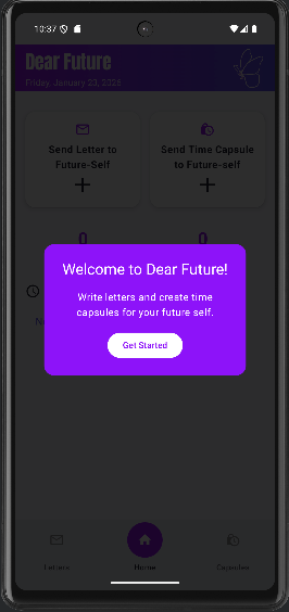
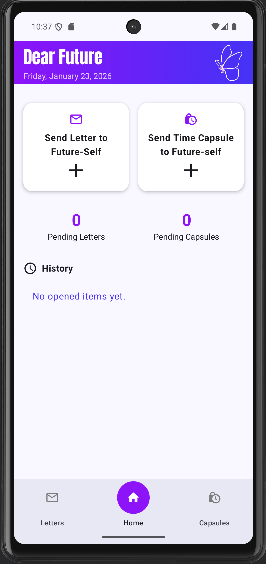
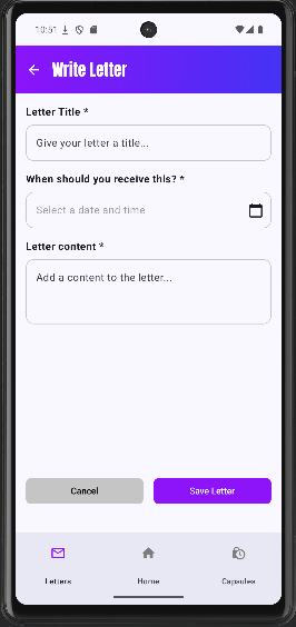
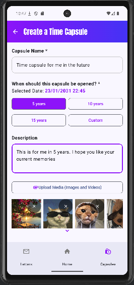
Final Hi-Fi Prototype
Clickable Hi-Fi PrototypeThe following prototype demonstrates the main screens of the Dear Future app and how users navigate between them.
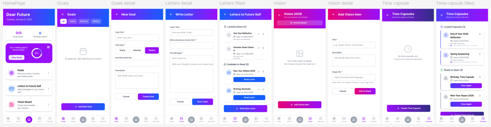
Old Hi-Fi Prototype
The following screens are of the first version of the Dear Future app, we made changes on the design after deciding to reduce the functions the app could do to focus on letter and time capsule sending for your future-self.
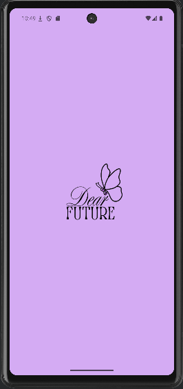
Logo(current)
User Flow
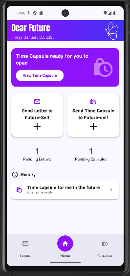
- The user starts on the Home Screen, which provides access to all main features.
- The user can navigate to Future Letters or Time Capsules.
- Each section allows the user to create, view, edit, and delete entries.
- Letters and time capsules remain locked until their selected open date.
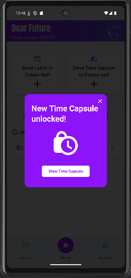
- When a letter opens, the user will receive a notification and a popup on the homepage.
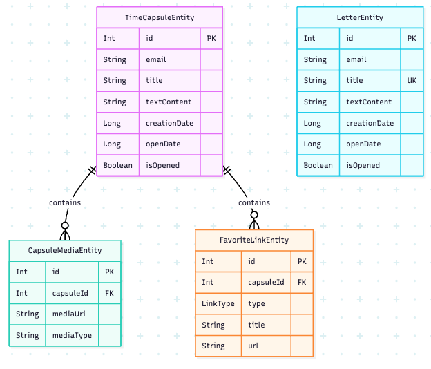
Entity Relationship Diagram of the SQLite database
Dear Future uses a SQLite database with a Room library to store data. There are four entities: LetterEntity, TimeCapsuleEntity, CapsuleMediaEntity, and FavoriteLinkEntity and uses three Data Access Objects to interact with these tables: LetterDao, TimeCapsuleDao, and FavoriteLinkDao.
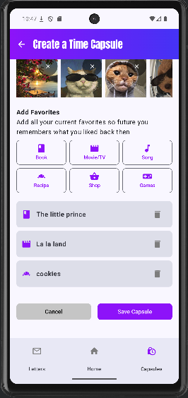
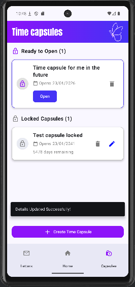
Main Screens
Explore the interface of Dear Future.
Usability Test
Plan:
Heuristic evaluation
- Add labels to the elements in letters ready to open(title, description…): Heuristics #1 and #6
- When editing no description no content with message explaining it: Heuristics #5
- History of letters and capsules: Heuristics #2 and #6
- Action that feel unrelated to the main idea of the app: Heuristics #4 and #8
- Unlocked letters should come before the locked: Heuristics #2
- Clearer description what page you are in: Heuristics #1
- Feels like no difference between a letter and a capsule, only the media: Heuristics #7
- Arrows different colors: Heuristics #4
- Error message when you don’t put text in the message/description user can’t make the letter/capsule: Heuristics #5
- Unable to go back to homepage from the detail letter/capsule view: Heuristics #6 and #4
The initial hypothesis or testable questions
How user friendly is the app?
Process
- Within-subjects testing
- 4 tasks with thinking aloud + SEQ after each task
- SUS Mobile
- Interview
- Debrief
Data to collect
- SEQ scores
- SUS scores
- Qualitative data
- Debrief
Which methods to use?
- SEQ questionnaire
- SUS questionnaire
- Thinking aloud
- Interview
Results
Subjects & demographics
- Users: 6
- Occupation: Students/Employed
- Age: 20-34
- Gender: 3 Female, 3 Male
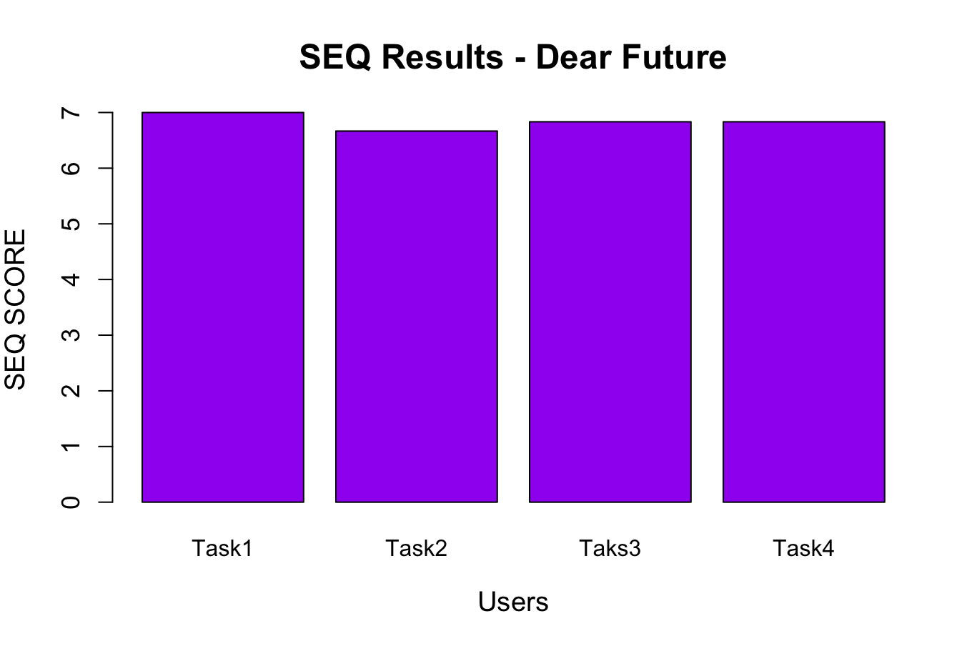
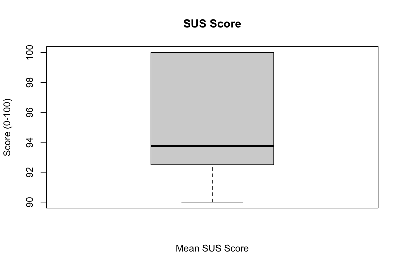
Visualisation of quantitative evaluation
SEQ Score Bar Plot
SUS Box Plot

SUS Box Plot Close up
Most relevant feedback
- "If shortcuts were not there it would've been harder"- User 1
- "I think adding an arrow to show when to scroll would help"- User 3
- "Making a capsule is quicker, you don't have to write a lot"- User 5
- "The edit button should be on the right and with a different color than the delete button"- User 6
Updates made to the app after feedback
- UI & Visibility: Updated all arrows to white for better contrast, added an arrow to the "Add Capsule" page, and changed the Edit icon to blue while keeping Delete grey.
- Visual Polish: Redesigned the "Locked/Unlocked" switch style, adjusted top bar font sizes, and added a white butterfly design element.
- Content & Layout: Shortened titles, removed "small text" to reduce clutter, and fixed the description text being cut off.
- Functional Fixes: Fixed the bug where unsaved letters occurred if the description was empty and ensured the previous date is retained.
- New Features: Added 5, 10, and 15-year options for capsules and expanded the "Favorites" category list.
- System Feedback: Implemented snackbar messages for creation, editing, and deletion, and added a new notification system.
- Performance & Navigation: Optimized app speed for older/slower phones and added a "Home" link directly from the Detail View.
Student Reflection
Hajar Rhachi
After these two weeks of CCL, we applied all the knowledge learned during the 3rd semester in the scope of 1 full project making a full android app. On top of using previous knowledge, I learned about many new functionalities while doing the tasks I was assigned. I mainly focused on designing the Hi-Fi prototype and the logo as well as working on the time capsule screen with its CRUD functionalities, the splash screen and logo icon, some of the functionalities in the homepage, user testing development/conducting, implementing the user feedback and the UI/Design implementation. I really enjoyed the process of thinking of new functionalities to add and trying to implement them and I'm really happy that we were able to implement most of the app's functionalities like we imagined. But of course, we still had some functionalities that we couldn't implement during these two weeks and that we would like to maybe develop in the future like email sending and authentication, expanding the favorites feature so that its connected to an external database... In conclusion, this CCL was very insightful. It's been full of surprises but it still ended up being a great process, especially in terms of organization and implementation.
Aruzhan Saduakaskyzy
The initial app concept was a bit more to what we have ended up implementing, however it made more sense to focus on the two main feature that we were always planning to do. I took mostly care of the letter implementation, user testing development/conducting, email implementation, data visualisation. My main challenge was to implement email as it required way more that we first accounted for, I was able to add a cloud data base Firebase and it worked nicely at first but to further develop the feature of actually saving the data remotely, triggering emails in the future and actual email sending was not in the scope of this project time wise and resources. I'm still glad that I tried to develop it, as I learned how many tools are accessible for independent developers in such projects and would definitely try again. Furthermore, user testing refreshed my knowledge from UEE class, we learned a lot from user's feedback and changed the app design/functions accordingly. I would say mostly our app met the initial concept as we were able to successfully write a letter and create a capsule(including the images/favorites), receive the notifications, and what would "improve" it would definitely be email sending feature.